Element-Level Customization
Some people with low vision, dyslexia, and other conditions and situations that impact reading need to be able to change the way text is displayed (e.g., make the text larger) in order to read it. To learn more, see Understanding User's Needs.
Some people need to be able to change text differently for specific elements, such as headings, lists, and paragraph text.
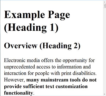
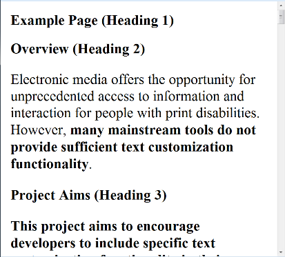
For example, Wayne needs large text, extra line spacing, a muted background color, and other text customization in order to read. If all the text was zoomed and increased proportionally (as in the second image below), the headings would be very big, navigation links would break across lines more, less text would be visible at a time, and the page would require much more scrolling. If all text was increased to be the same size (as in the third image), headings can become indistinguishable.
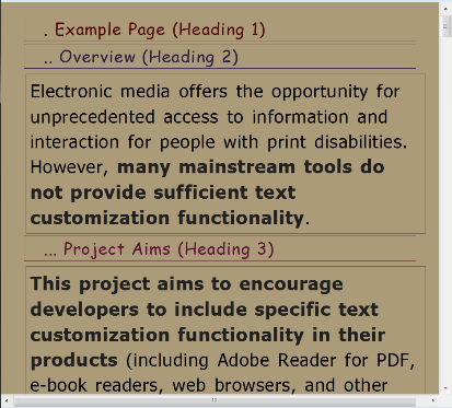
To make web pages readable, Wayne uses a style sheet to change the way the headings are displayed (among other things). He makes the headings a little smaller than the main text, uses a different font and color, has little space before and after, and adds borders, as shown in the fourth image. By changing the heading elements differently than that main text, Wayne can easily distinguish headings without the drawbacks of having them too large.
Support for element-level customization:
- Tools and technology: Most word processing software (such as Microsoft Word), has "Styles" that let you change elements. For web pages, you can use "user style sheets" to change elements, although it takes some knowledge and skill to set them up. (Also, websites need to be designed in a way that will work with your user style sheet. ) PDF Reader does not let you change elements differently at all.
- Standards: Some accessibility standards for electronic media do not address the issue of element-level customization at all.
Below are perspectives about the importance of being able to customize text at the element level.
Study Findings
In a study on how people customize text in user style sheets, 9 out of 16 user's style sheets had headings customized differently from body text.
In a study on how people customize text in a word processing program, users changed headings different from the main text. Some changed the headings using “Styles” in the word processor; others selected each heading and changed it. One participant who was having trouble with the Styles, selected all the text and set the text size. He then commented about losing the distinction of the headings. Two participants pointed out that they set headings smaller than the main text because headings are easier to read since they are short and have space around them.
User Research Survey Data
The following is from the User Research Survey on Changing Text Display for Easier Reading. The chart and table in each section repeat the same data (for people who process information differently). Comments are filtered for relevance and roughly grouped; they are not edited. There is no meaning to the numbering of the comments; they are numbered only to make it easier to refer to a specific comment.
Findings
- 86% responded that element-level customization is 'Very important' or 'Important' for others
- 53% responded that it is 'Very important' or 'Important' for themselves
It is apparent from the comments that some respondents did not understand the question. Some answers may be about having elements formatted differently by default, as opposed to users being able to customize by element.
It is also apparent that some respondents did understand the questions; for example: "...it is reliant on having a correct semantic structure. More often than not the correct semantic structure is not available, for example a 'heading' actually being an in-line styled bit of body text." Some comments were about the skills required for element-level customization; for example: "In my experience most web users (apart from those who work in ICT) don't know how to change the way text is presented on the screen. Many don't even know they can increase text size with the computer settings or browser controls."
It is possible that some respondents rated element-level customization of lower importance because they did not understand it, they've never done it, or because of the skills required.
Comments about others included:
- Most of my clients would want to customize text differently for specific elements, according to their visual tasks.
- Allow people to use their own style sheet
- It impacts greatly the ability to skim a text, which is very very important when you have difficulty reading and might want to chose only some parts of the text to focus on.
Comments about themselves included:
- It's very important to me, but it will never happen.
- I like to make certain parts a different font to make it stand out sometimes.
- I've never tried this, but I would find it easier if I could make different changes to the elements
The survey question included examples, which introduce potential bias. For example, people who do not like underlined text are likely to be biased against the second image. However, without images, this question would have been even more difficult to understand. Therefore, in designing the survey, I decided the tradeoff was in favor of providing examples.
Survey Question
Sometimes people can customize text differently for specific elements, such as headings, lists, and paragraph text. For example, people can change the heading text to be displayed one way, and change the main paragraph text to be displayed a different way. Sometimes people can only customize text display the same way for all the text.
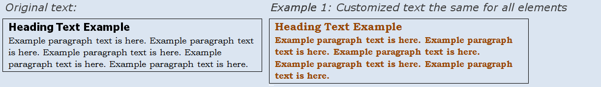
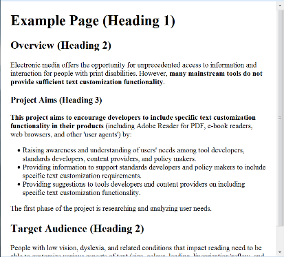
In Example 1 above, people cannot change text differently for specific elements, so all the text has the same changes. The heading text and paragraph text are the same color, font, and style.
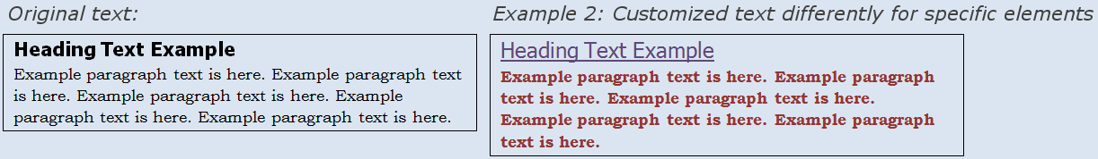
Example 2 above shows text changed differently for specific elements; heading text and paragraph text are changed to different colors, fonts, styles.
For others
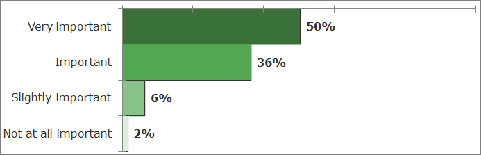
Question: How important do you think it is for other people — including people with low vision, people with dyslexia, people reading in low light when they're tired, older people, etc. — to be able to customize text differently for specific elements, such as headings, lists, and paragraph text?
Answers: 187
| Answer Options | Response |
|---|---|
| Very important | 50% |
| Important | 36% |
| Slightly important | 6% |
| Not at all important | 2% |
| I don't know | 5% |
Comments
- Most of my clients would want to customize text differently for specific elements, according to their visual tasks.
- Allow people to use their own style sheet
- I think it's more important the text on websites are clearly marked in the code as being headers, paragraphs, etc. Instead of using <font size="11"> use <h2>
- It impacts greatly the ability to skim a text, which is very very important when you have difficulty reading and might want to chose only some parts of the text to focus on.
- It's a method to teach those with challenged vision. It might not occur to everyone that it could be a big help. There's the cost factor, too. But you may be in the process of designing a machine an individual can use to do this for themselves.
- When they are attending conferences, it is good to be able to manipulate the presenters' materials this way.
- For a dyslexic person, it is easier to see the differences, to see titles. For my MD, I can pick up differences in color and know there is something there I need to pay attention to.
- greatly facilitates scanning
- Very Important
- It seems important, but I don't know how important it is.
- It would vary depending on the disability the person has
- Depends upon the specific individual who needs the material.
- Customizing the text differently for different elements seems to me to clearly impede readability. I'm not sure why anyone would want to do this. Just as a side comment.....there are a lot of popular magazines that seem, these days, to change fonts/elements all over the place on a single page with no rhyme or reason, and I find that very difficult to read and also a bit unsettling (everything's too busy). I can also imagine that for people with cognitive/learning disabilities, the constant changing of aspects of fonts would be a hindrance and a distraction, not a help. Just one other comment - what people want or think they need is not always indicative of what they actually need or what will help them perform best.
- But I'm not sure that most people would actually understand how to accomplish this. Most of the folks I know barely know how to increase font size in a browser, much less control which elements get enlarged.
- I think this option would be too confusing for most of the people I've worked with.
- In my experience most web users (apart from those who work in ICT) don't know how to change the way text is presented on the screen. Many don't even know they can increase text size with the computer settings or browser controls.
- Depends entirely on the original formatting, and also impossible implement correctly, as it is reliant on having a correct semantic structure. More often than not the correct semantic structure is not available, for example a 'heading' actually being an in-line styled bit of body text.
- confused by the question
- colors are specific to individual people. Using bold is usually OK. The color of the text as well as the background is very important and may be different for each person
- You have mismatched text. One is going to be the right size and the others are either too big or too small or in a bad font or bad color.
- I can only speak for myself here (see earlier answer) - I don't have test data about this.
For You
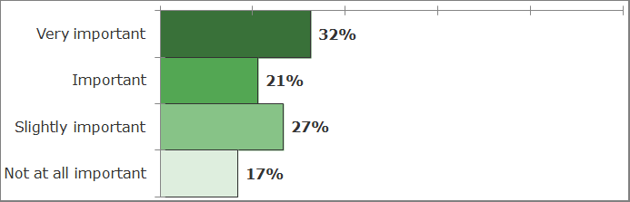
Question: How important is it for you to be able to customize text differently for specific elements, such as headings, lists, and paragraph text?
Answers: 204
| Answer Options | Response |
|---|---|
| Very important | 32% |
| Important | 21% |
| Slightly important | 27% |
| Not at all important | 17% |
| I don't know | 3% |
Comments
- It's very important to me, but it will never happen.
- I like to make certain parts a different font to make it stand out sometimes.
- This helps me grasp the meaning of the text.
- Makes it easier to look at and read.
- Easier to distinguish specific elements in 2 and see them. The example 2 makes a big difference for me..my brain and eyes understand there is two things there, Using my good eye only, I find I also like it better..stands out..
- Important, but only if I'm not in a hurry, or if this is a source I will capture and refer to more than once.
- I can probably do this through local style sheets, but usually, the developers' CSS overrides my own, or I'm too lazy!
- All depends on what I am reading, and why. If I am reading a news article for fun, I wouldn't care about headings. However when I in college, or now work, being to identify a heading was important
- It matters more when there's a lot of sub-headings in the text but this is fairly uncommon in web pages. For things like textbooks, say, it matters more.
- I write newsletters. It would be great if I could change the headings to call attention to the article.
- I've never tried this, but I would find it easier if I could make different changes to the elements
- If text was not customized, I would be confused. It will take longer me to process information that is different.
- The tradeoff is interaction complexity, of course. I fuss about such things but on most days I just want to get on with my day, not play with my settings.
- Very important or else I get too tired if it is alot of text and I just dont read it
- Yes, it is better to be able to change all, although this example is a bit odd because it's all serif fonts and horrible to read
- Though the customizations here are not good for me, I find when I write papers I play with formatting a lot. I'll also sometimes forward emails I've received to myself so that I can reformat them.
- Could be very important, as headings help you quickly locate information.
- It really depends on how much of it must be suffered through on whether there is any importance.
- It just needs to be easy to read
- Good visual cues
- How MS Word deals with this is annoying. I am always having to undo something they have been way to helpful in doing for me. It is annoying. Then try to find somewhere in all their buttons and menus the right choice to fix the problem. Another issue. I can customize a parent window in MS but the child windows remain the default. For example I can highlight Outlook but when I try to put a new person in address book, the child windows are not highlighted and become lost in the background
- Colors, typefaces, and elements, in certain combinations, can be very tiresome and painful to look at.
- I do not own or frequently use accommodations that allow for this, or if I do, I do not know how to use these features. I guess it might be important, but if I have to make to many alterations to read something, I prefer to use a speech access screenreader and have the material read to me.
- The main issue is contrast.
- "I don't want to care about that. Experts should format the texts in the right
- way."
- I don't. I use agency standard font for all text. (and it easiest for me to read!)
- "Interesting question!
- This has never occurred to me, and I can't picture a use case for this. If I were to customize text, it would be to either change from serif to sans serif font, from a non-bolded to a bold font, OR to increase the point size / zoom in - throughout the document or page."
- As long as you can tell the difference between different elements (eg heading text is bigger or bolder than regular text, I actually prefer there to be some consistency in the text (eg I'd rather the text doesn't keep changing colour, or font face etc.
- Otherwise it would look like it's all running together
- As long as the approach is useful, I don't care what it is (underlining versus bold versus colors, etc.)
- Most headings don't ned to be adjusted and if I adjust the text and the heading adjusts accordingly it takes up 1/3 of the page so I have to scroll more.
- It would be helpful to be able to change fonts to a bold style for my eyes
- Very imporant for web pages since dynamic multimedia page desings don't print well. It can be diffcult sometimes to get the information needed and dump the confusing eye candy.
- If everything looked like examples 1 and 2, I would stop reading immediately.
- it would simply be nice, however, it is far easier to create emphasis via font changes, and numbers, bullets, indention, than those many customized text option, on every Word program now. But, this does depend on why someone is using a program.
See Also
- Text Customization for Readability introduction
- Understanding users' needs to be able to customize text in order to read, with personal stories and example text displays.
- The aspects of text display that users need to be able to customize
- Support for text customization in tools, technologies, standards, and guidelines