Text Display Aspects that Users Need to Customize
This page describes aspects of text display that people need to be able to customize in order to read text.
For context, please see:
- Text Customization for Readability for an introduction to the big picture issue.
- Understanding people's need to be able to customize text and When Text is Not Displayed Well
Note: The headings below used to organize the list are not particularly significant, and some aspects apply to multiple headings but are listed only once — for example, leading is listed under Reading (Spacing) yet it also helps with Tracking.
The quoted text below is the wording from the User Research Survey on Changing Text Display for Easier Reading.
Perceiving (Letter Characteristics)
- Size
- "Text size (font size)"
- Font
- "Font face (the letter shape; e.g., Times New Roman, Arial, Helvetica; also called font family or typeface)"
(Note to tool developers: When providing users a list of fonts to choose from, present the font name in the font itself — e.g., Times, Verdana, Courier — so users can tell what each font looks like.) - Color
- "Text colour and background colour"
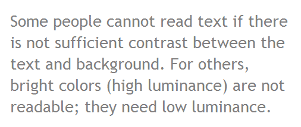
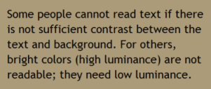
Some people cannot read text if there is not sufficient contrast between the text and background, for example, gray text on a light background.
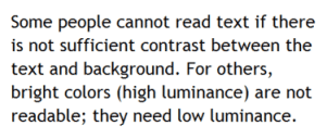
High contrast (for example, dark text on light background or bright text on dark background) is required by some people with visual impairments, including many older people who lose contrast sensitivity from ageing. For example:
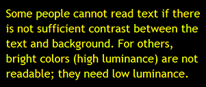
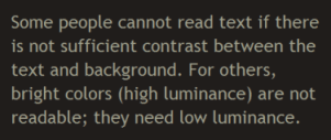
While some people need high contrast, for others — including people with some types of reading disabilities such as dyslexia — bright colors (high luminance) are not readable. They need low luminance, for example:
- Style
- "Text style - underline, italic, bold"
For some people, it is difficult to read text that is underlined or italicized. For some, bold text is easier to read. - Capitalization
- "Capitalization (all capital letters, small capital letters, sentence style)"
Text in all capital letters is more difficult to read for most people (with and without disabilities).
Reading (Spacing)
- Leading
- "Line spacing / line height / leading (space between lines in a paragraph)"
- Letter spacing
- "Letter spacing (space between letters/characters)"
- Word spacing
- "Word spacing (space between words)"
- Element spacing
- "Space between elements (e.g., space between paragraphs, or space above headings)"
Having additional space between elements helps most people group information. For example, having more space above a heading, and less space below it help associate the heading with the text below. - Margins
- "Margins (blank space around blocks of text)"
Having wide margins around blocks of text helps focus on the text and not get distracted by surround text, images, etc.
Tracking
- Reflow
- "Text in one continuous block, instead of in multiple columns (change it so that you/they do not have to go from the bottom of one column up to the top of another column to read text; e.g., changing text from 3 columns to 1 column; sometimes called reflow)"
Especially when text is enlarged, it can be extremely difficult for people to get from the bottom of one column to the top of the next column, and keep their reading flow. See Scrolling. - Horizontal scrolling
- "No horizontal scrolling (change it so that you/they do not have to scroll to the right to read a line of text; instead, text wraps to the next line without requiring scrolling; sometimes called rewrap)"
Some people have difficulty going from the end of one line of text, scrolling horizontally, then finding the next lines of text, and keeping their reading flow. See Scrolling. - Line length
- "Line length (how long or short the lines of text are)"
It is more difficult to read very long lines of text. - Justification
- "Justification / alignment (left, right, full/both, centered)"
Sometimes full justification makes reading more difficult because extra space between words causes "rivers of white![[links off site]](images/linkexternal.gif) ", or less space between words makes it difficult to distinguish separate words. Some people find it easier to track from the end of one line to the next with full justification, and others prefer left justification (for left-to-right languages).
", or less space between words makes it difficult to distinguish separate words. Some people find it easier to track from the end of one line to the next with full justification, and others prefer left justification (for left-to-right languages).
Distinguishing
- Element-level customization
- "...customize text differently for specific elements, such as headings, lists, and paragraph text"
For example, some people who need large text set headings to be smaller. See Element-Level Customization. - Proportional text increase
- "...choose whether or not all text increases proportionally; for example, headings remain bigger than main paragraph text"
- Borders
- "Borders around blocks of text (including border line color, width, style)"
Some people prefer to use borders to indicate headings, rather than have them much larger than the main text. - Indentation
- "Indentation (e.g., space in front of list items, the first line of a paragraph)"
Understanding
- Hyphenation
- "Hyphenation turning it on or off (word breaks; when a long word is at the end of a line, either separating the word with a hyphen, or putting the whole word on the next line)"
For some people it is especially difficult to understand words that are hyphenated.
Printing
- Printing customized text
- "...print text after you/they have customized it to make it easier to read"
It is difficult for some people to read text on the computer; they need to be able to print electronic text on paper in order to read it. See Printing Customized Text.
Sources
These aspects of text display that users need to customize was developed through a literature review, a study of how people customize text with word processing software, a study of how people customize text in user style sheets, and a user research survey on changing text display for easier reading.
Update: Similar requirements are included in Daisy Consortium's May 2013 Accessibility Screening Methodology Guidelines and Checklist For Reviewing the Accessibility of eReaders and Digital Reading Systems for Persons with Disabilities.
Acknowledgements
Color text and images taken from:
Easy Checks - A First Review of Web Accessibility. Shawn Lawton Henry, ed. Copyright © 2013 W3C® (MIT, ERCIM, Keio, Beihang). Status: Draft Updated 9 July 2013. http://www.w3.org/WAI/eval/preliminary